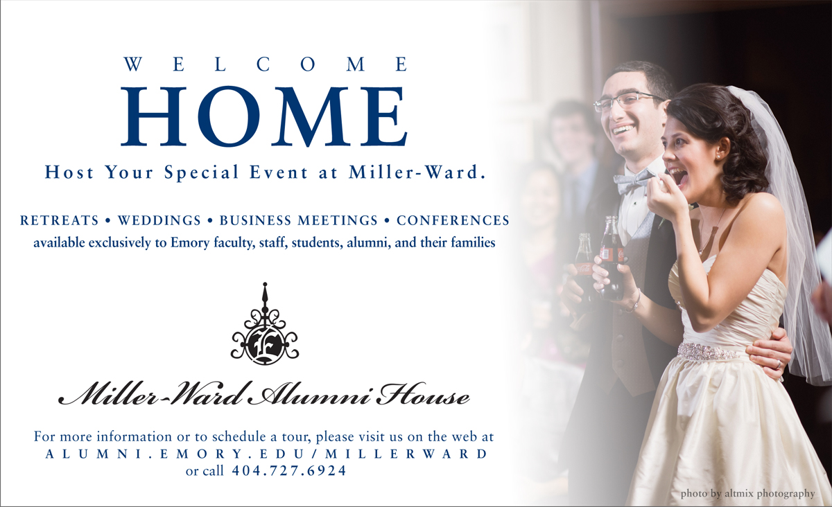
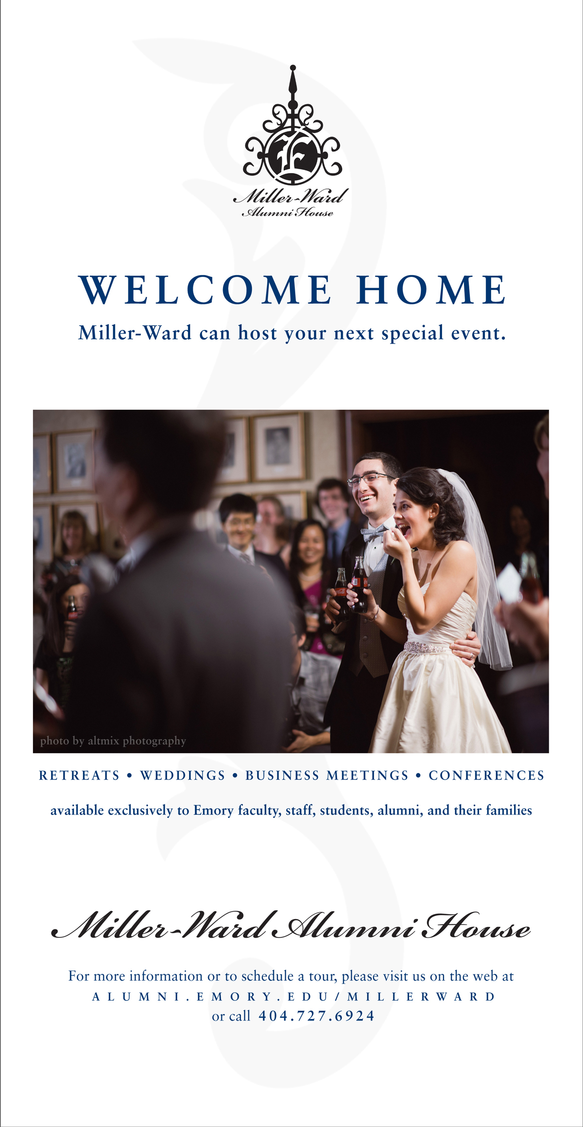
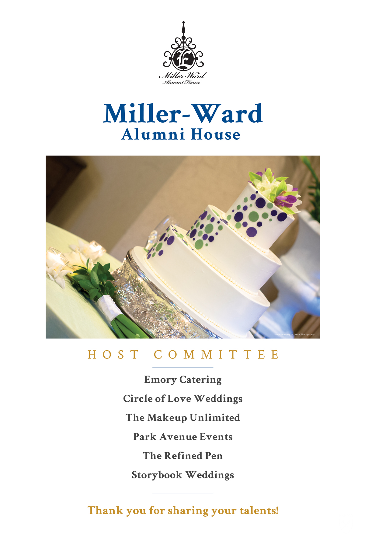
Soon after I began working at the Emory Alumni Association, I was tasked with implementing an existing brand that featured a rather ornate logo (based on a wrought-iron archway on the property) and script typeface that didn't scale well for digital, but worked well at conveying the formal elegance of the venue in print designs. I was responsible for all marketing materials from 2012-2015, including the overall look and layout, all photo selection, and in the case of the "home" and "celebrate" pieces, writing and editing copy.
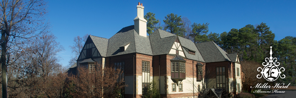
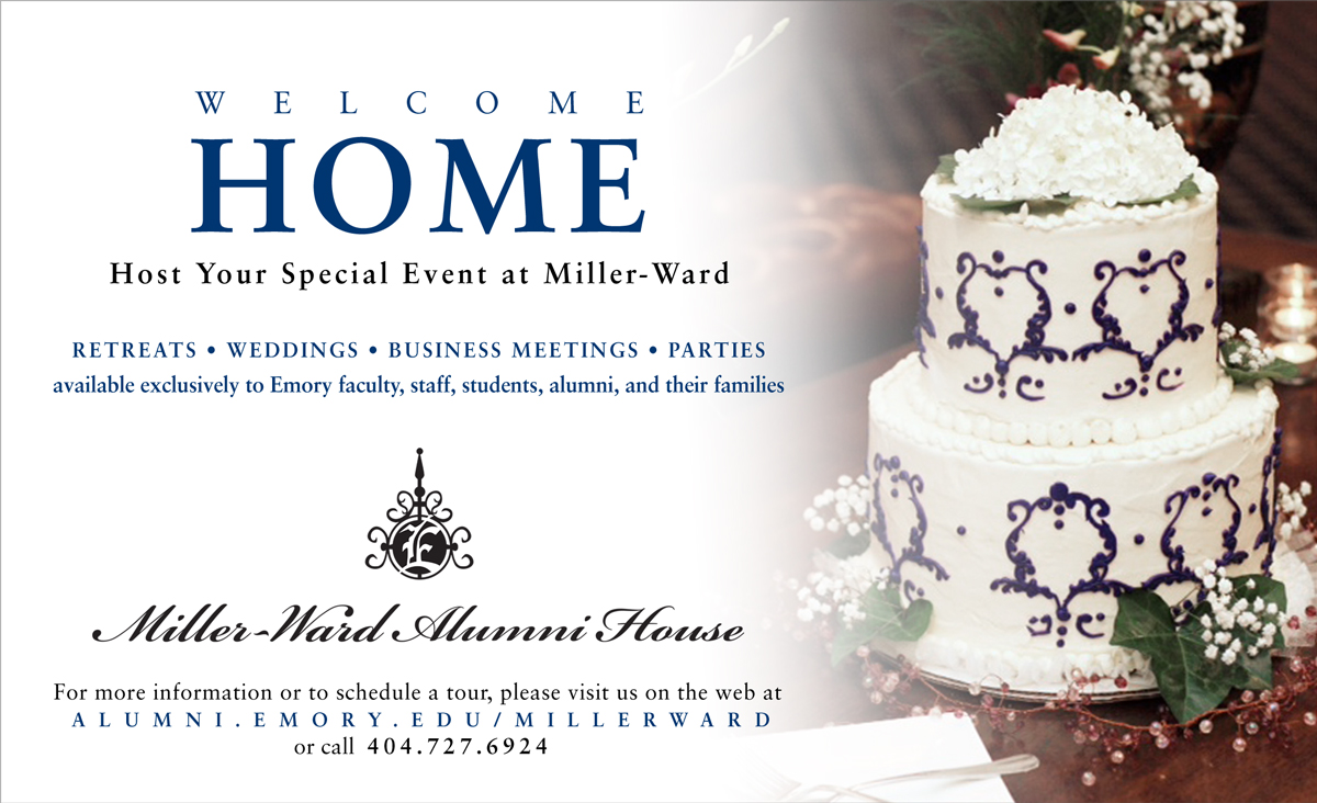
In 2015 Leadership approved a slightly simplified update to the logo and wordmark, using all caps in a more scalable typeface. You'll see both identities in the work displayed here, consisting of:
• formal print advertisements
• Facebook page cover graphics
• newsfeed graphics (for Instagram, Facebook, and Twitter)
• banner ads for web and mass emails
• branded imagery and callout elements for the website
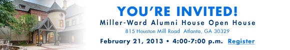
• event signage