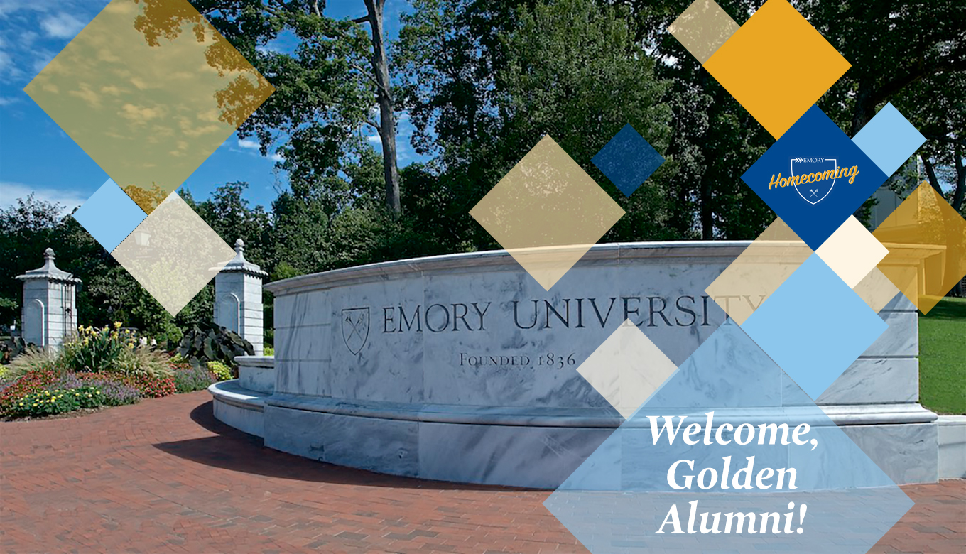
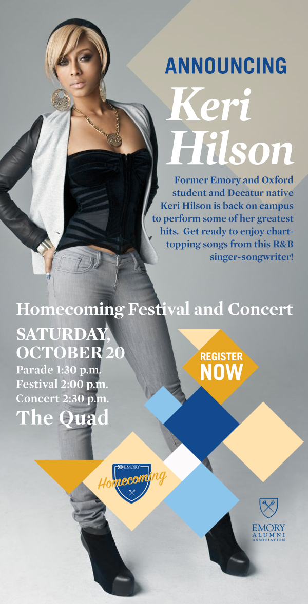
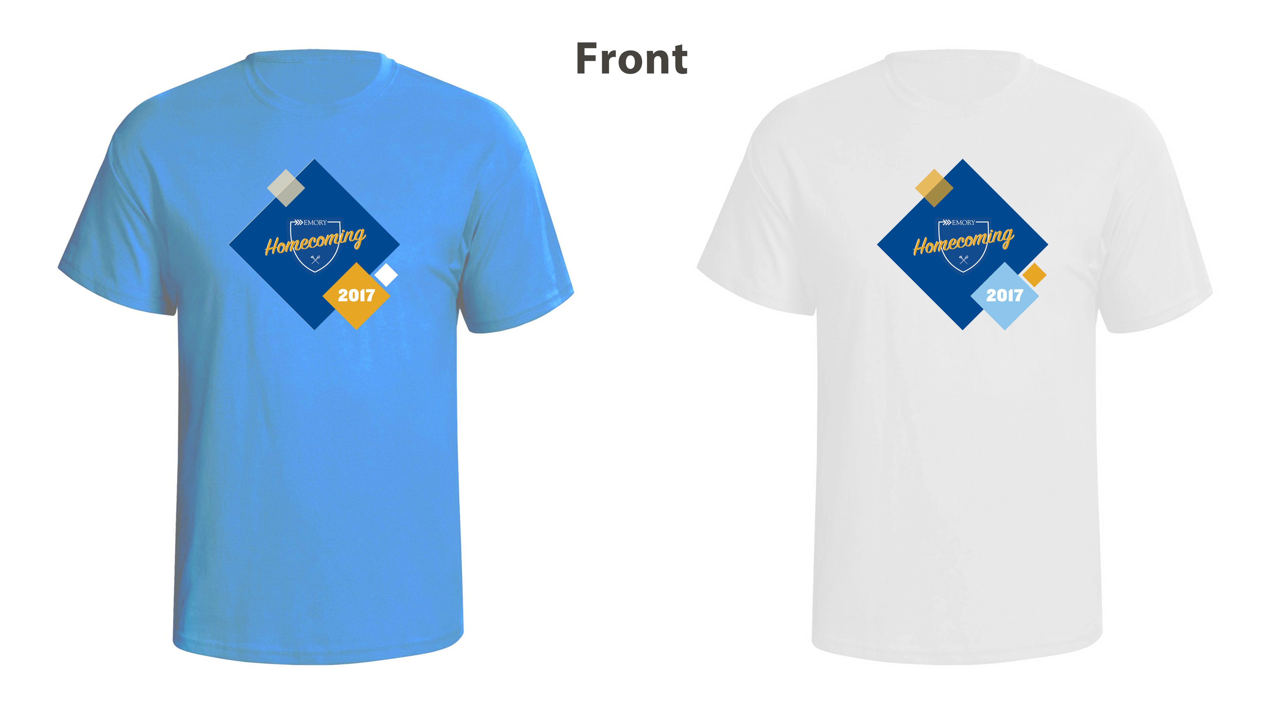
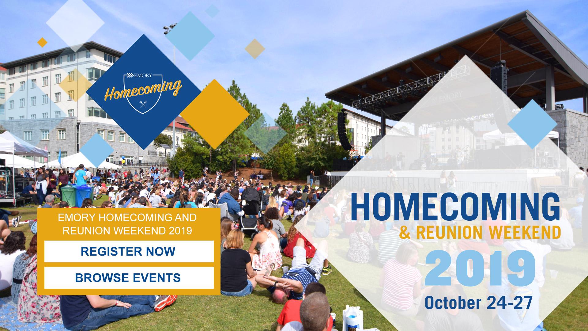
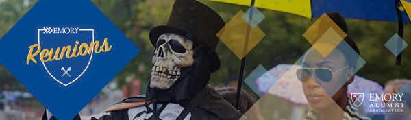
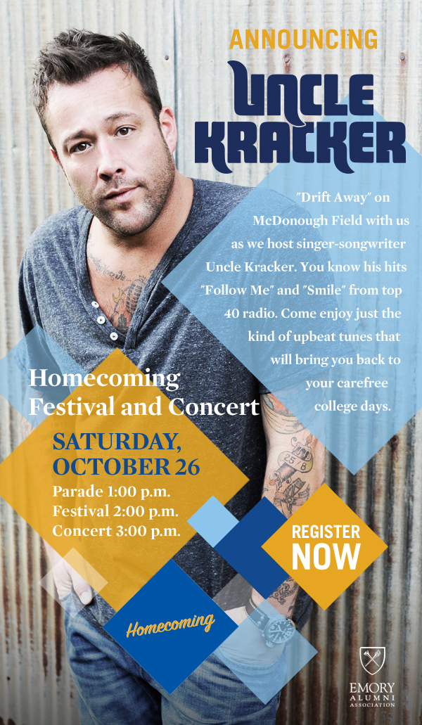
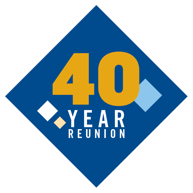
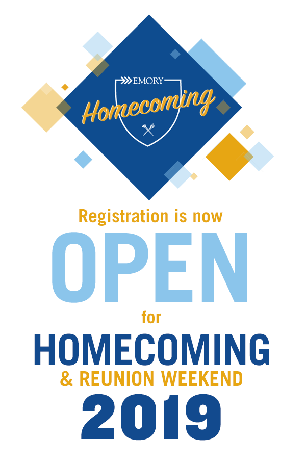
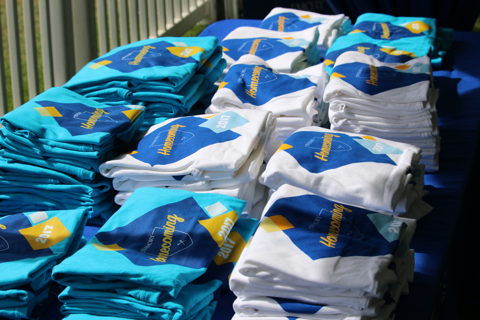
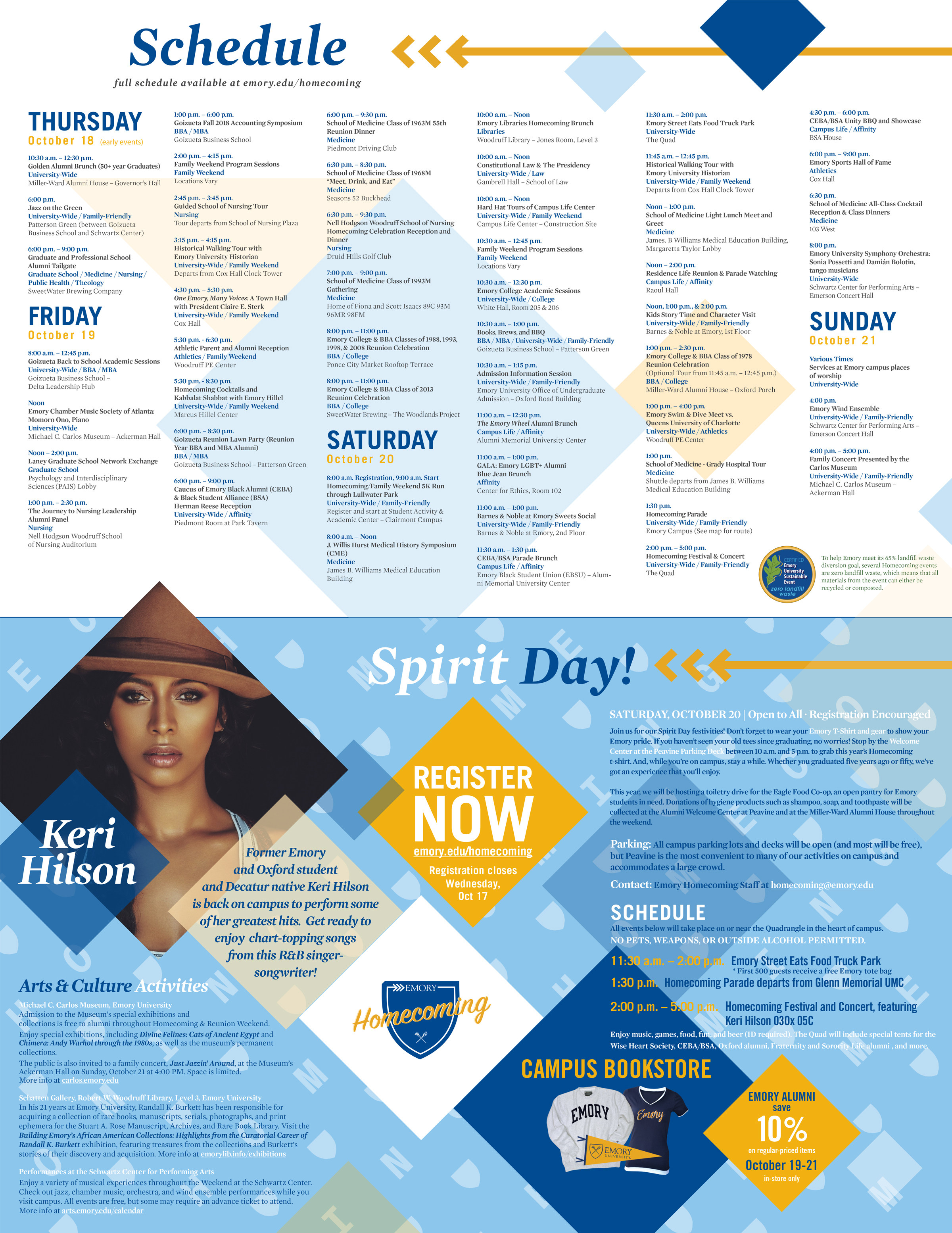
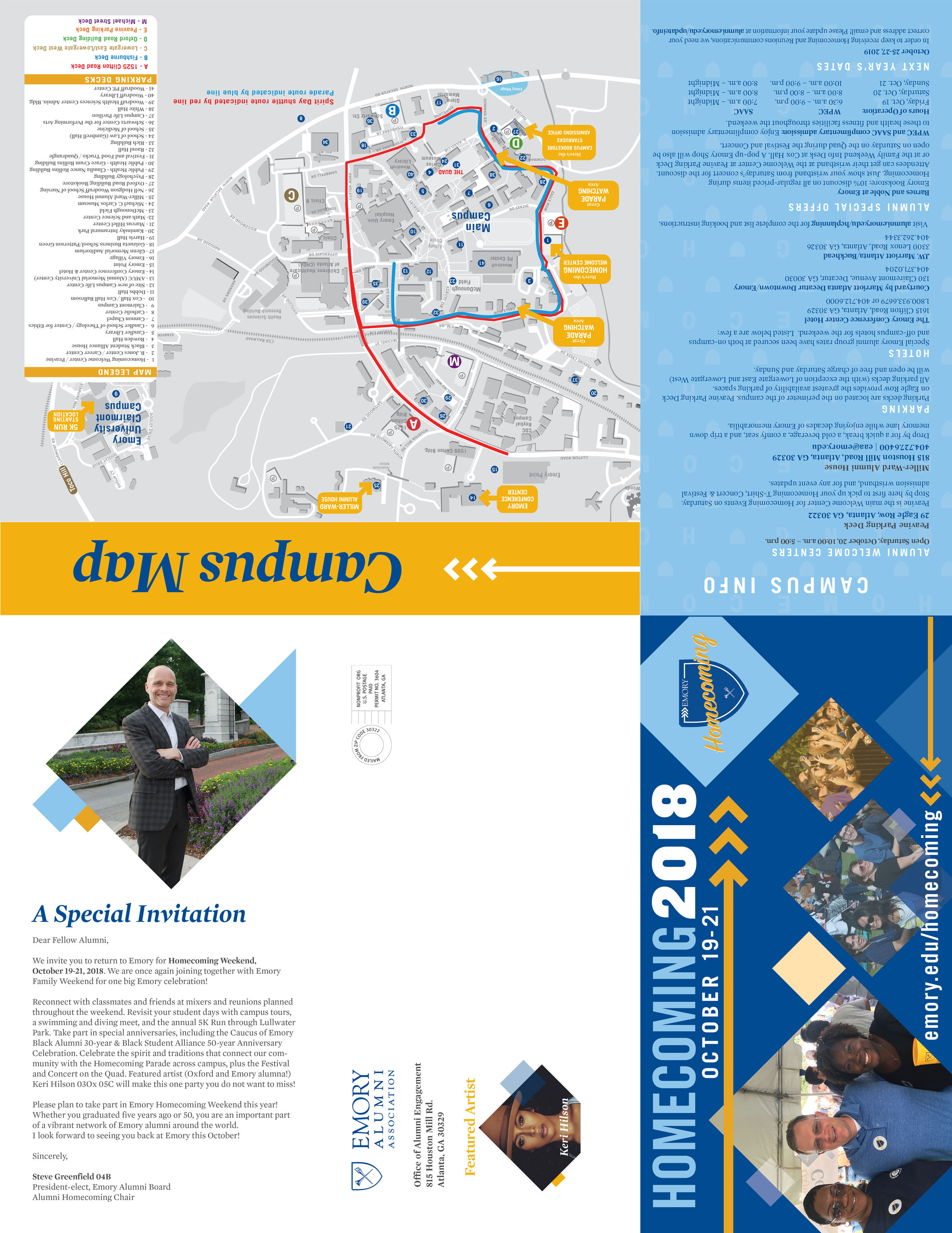
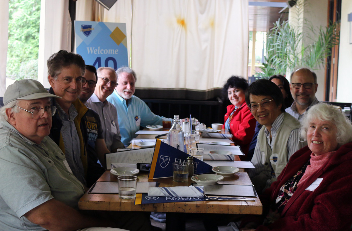
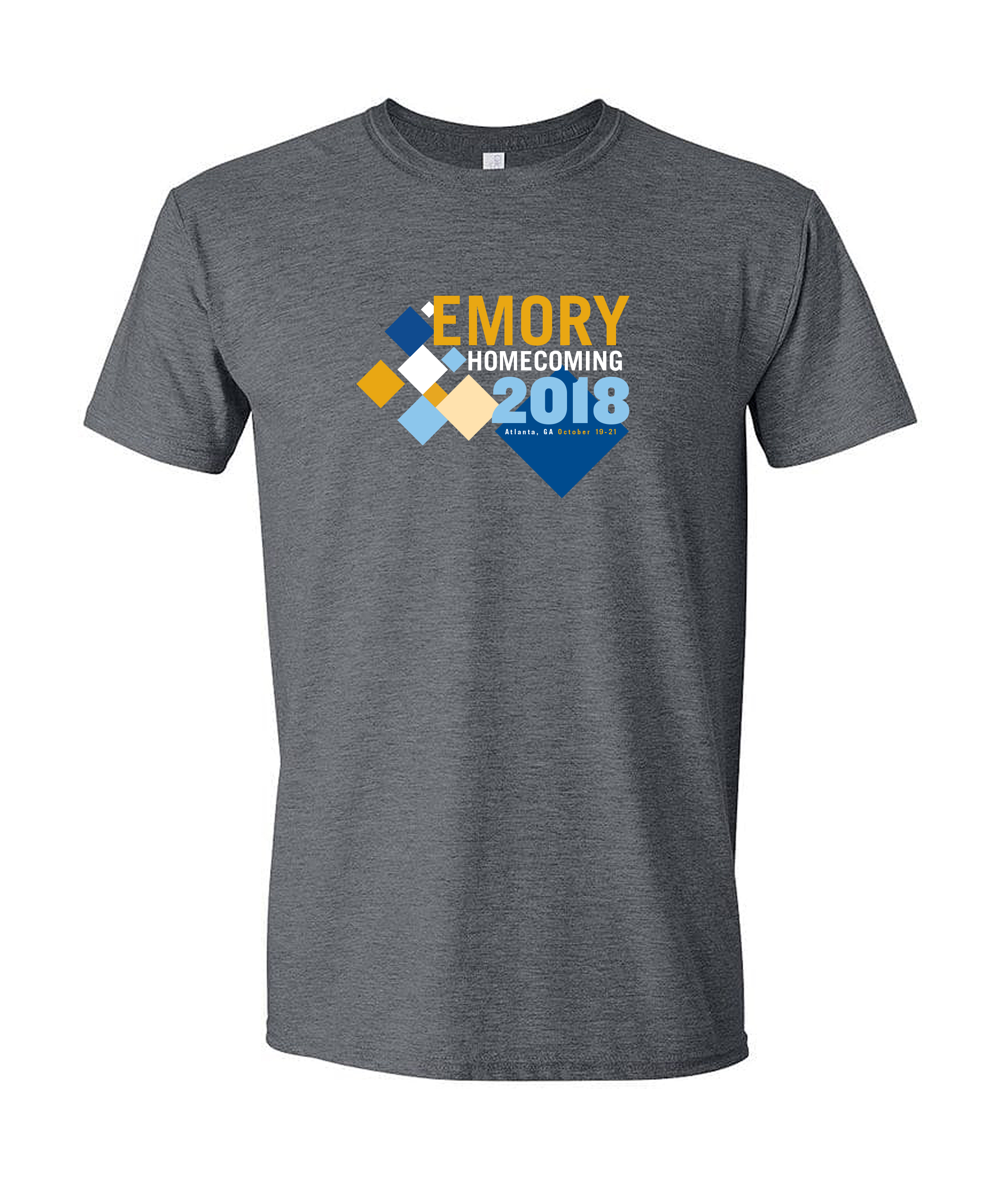
Leadership approved a complex new Homecoming brand created by Emory's central branding, which included a much more sophisticated array of typefaces and colors and an equilateral diamond motif that relied heavily on photos and transparencies.
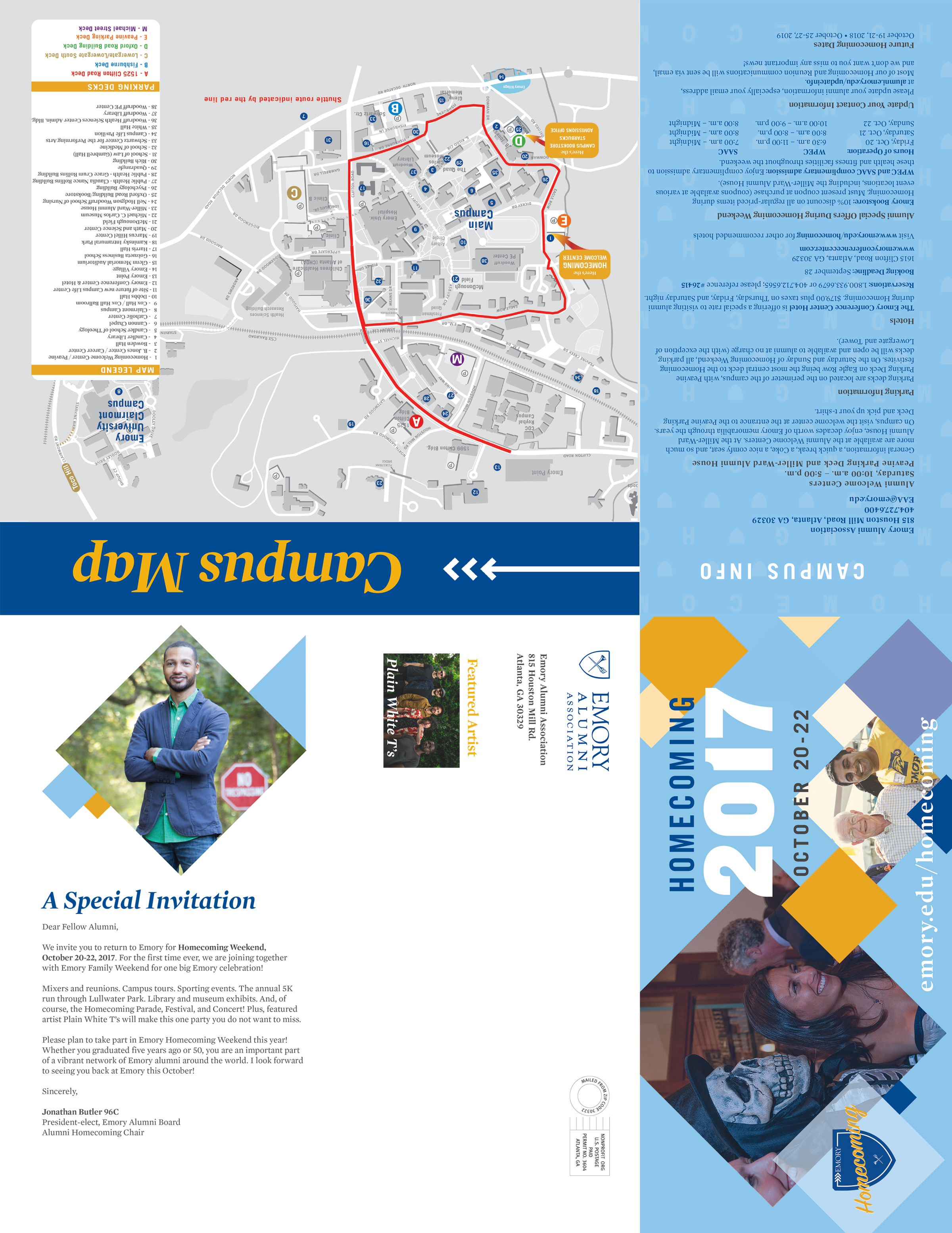
As with the previous five years of Homecoming production, I was responsible for creating and rolling out all of the assets for the new brand, often with little opportunity for oversight or collaboration with other designers. This new look would once again be visible everywhere, including:
• mass emails
• social media graphics
• registration sites
• website elements
• print advertisements
• large six-panel mailers
• small-scale signage
• large event banners
• t-shirt designs
• swag items
The diamonds and the softer color palette were intended to evoke memories and nostalgia, and alumni responded very positively to the look. And visually balancing those diamonds with all that type and photography, as well as choosing photos that served our purposes and worked within the diamond shape, proved to be a fun challenge.