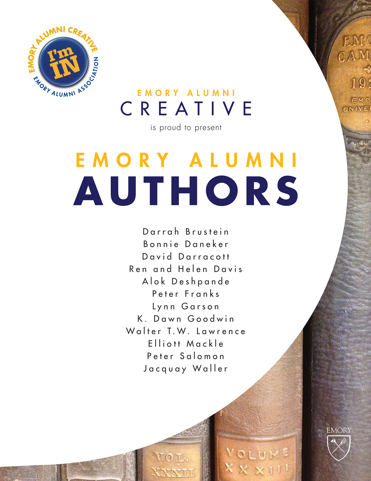
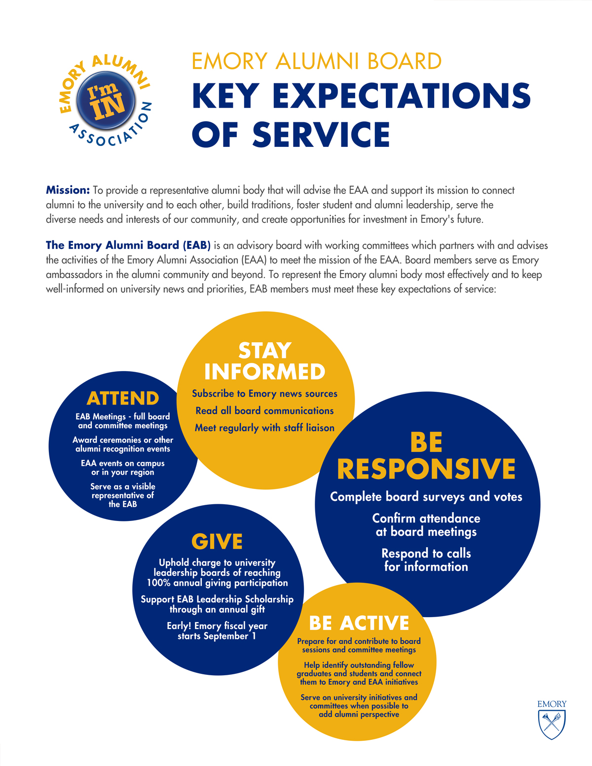
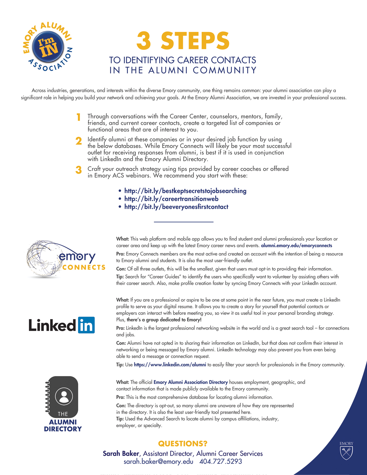
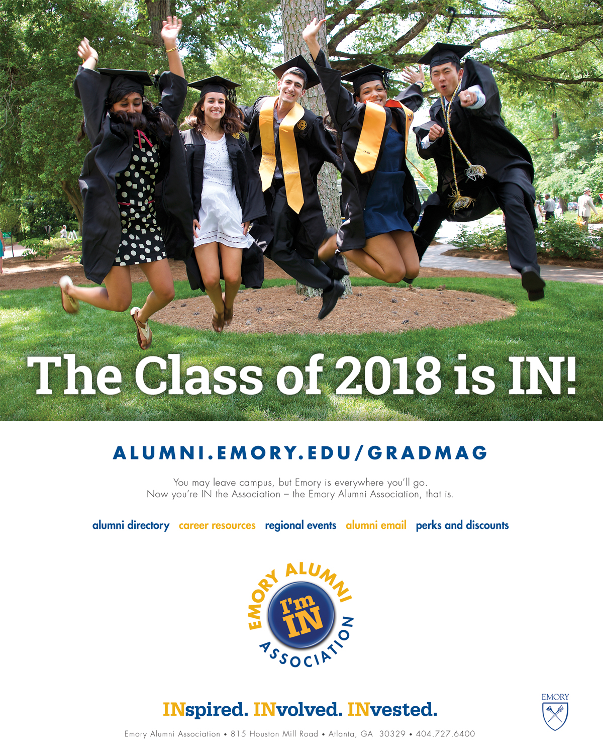
The brand, created by an internal Emory communications department, was still being developed as I was tasked with implementing it, but its simple, general thrust was the idea of being part of a unique and proud group of people, embracing the phrase "I'm IN" and all of the connotations that phrase carries (perks and benefits, personal and professional connections, achievement, and prestige). When appropriate, the design would also incorporate the phrase "INspired. INvolved. INvested."
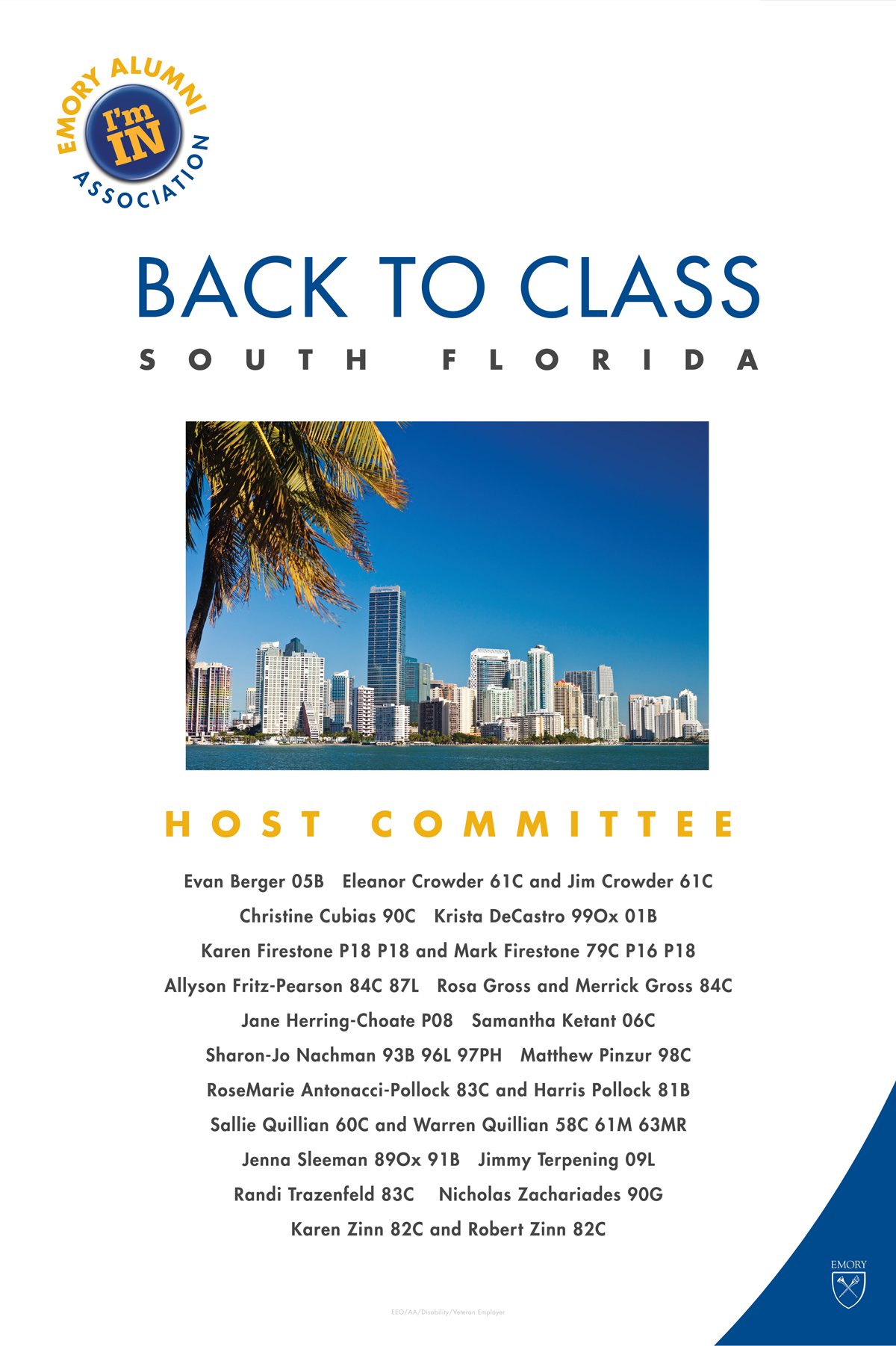
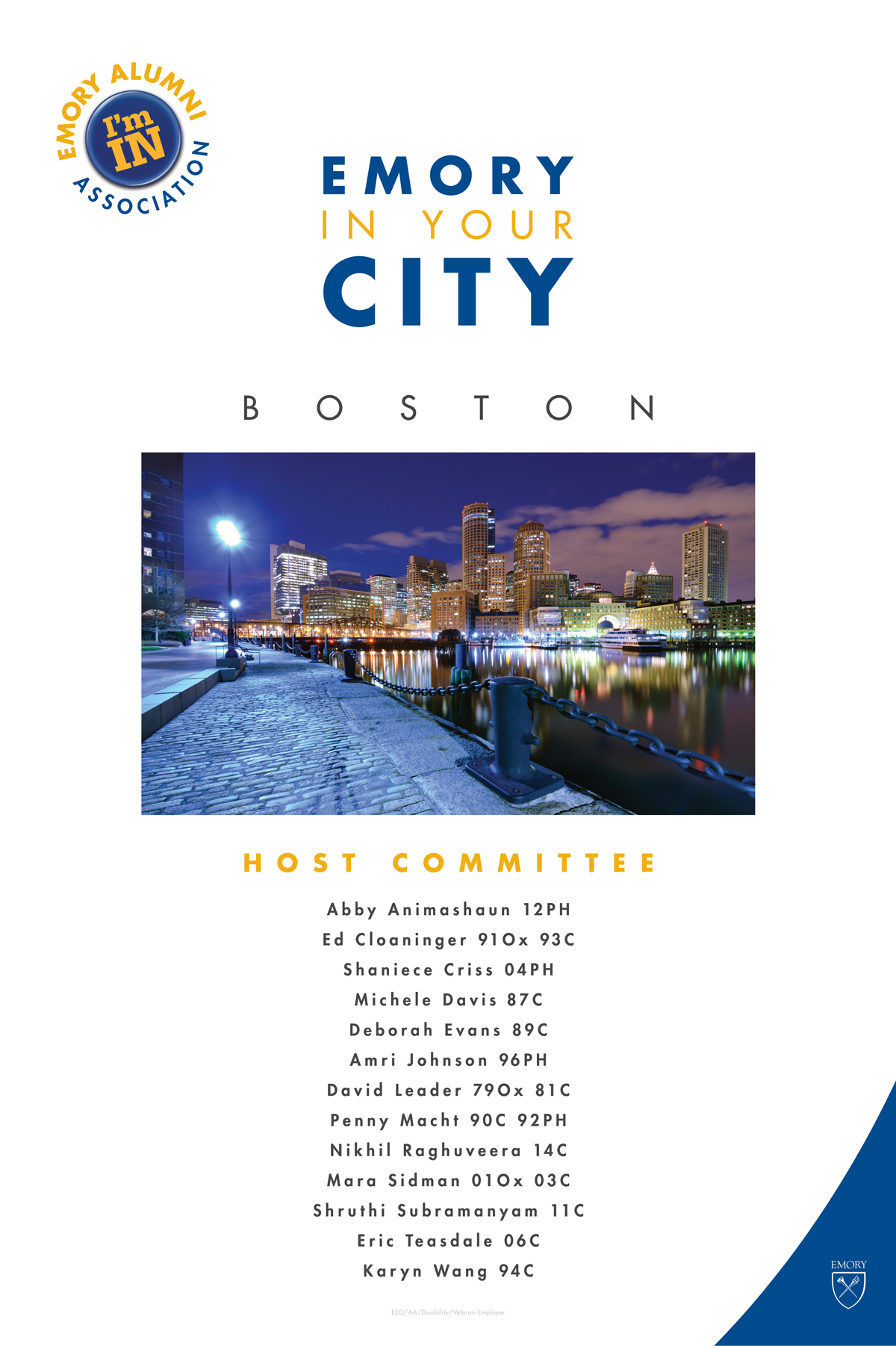
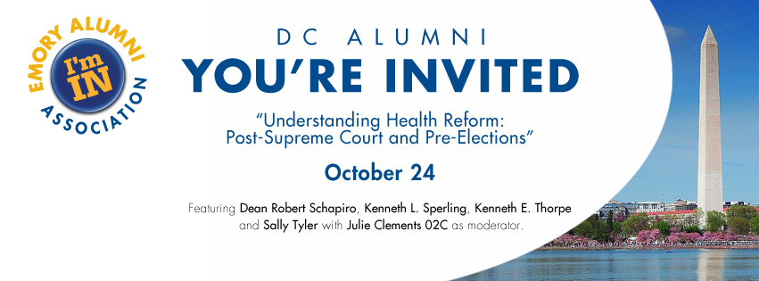
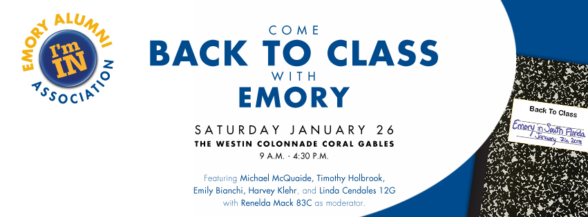
The brand's visual elements included numerous versions of a representational 3-D "I'm IN" button, to be used with slightly different shades of the Emory blue and gold, the Futura and Serifa Bold typefaces, a dynamic "swoop" shape (usually in blue), ample white space, and these were always to be paired with one of the many versions of the Emory shield logo. These choices led to some challenging and fun designs that, while still within Emory's traditional identity, were bold and asymmetrical and clearly different from anything else Emory alumni and constituents were seeing.
Starting in early 2012, I became responsible for iterating this look in thousands of different pieces across multiple channels; this was the Alumni Association's new look, and it needed to announce itself and be prominent. From large events to small gatherings, social media graphics to flyers and signage, mass emails to SWAG items and stationery, and a redesign of the website in 2014-2015, the "I'm IN" brand became the signature, recognizable look of the Emory Alumni Association.


